I once thought about designing a typeface and did a lot of research and references, only to realize how incredibly complex font design truly is. At the time, my goal was to create a visually appealing font, but this required considering countless factors, such as stroke weight, glyph design, and more.
Different font weights (like light, regular, and bold) determine the visual impact and use cases of a typeface. Variations in thickness affect readability and emphasis. Ensuring stylistic consistency across weights while balancing character width and height ratios for visual harmony felt extremely challenging for me.
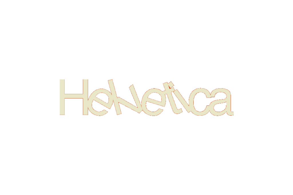
Later, while experimenting with a UE demo, I noticed that generated fonts could incorporate physical properties. The idea of letting all letters float in water to achieve natural equilibrium or stack organically—ultimately forming a typeface artwork—seemed fascinating.